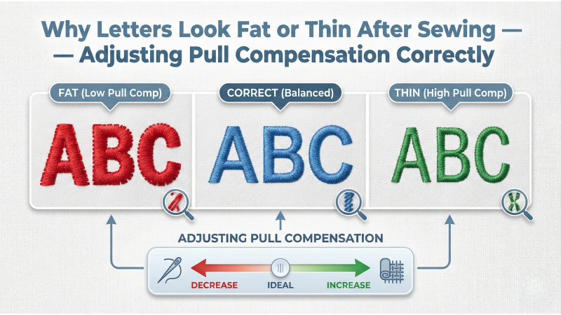
Why Letters Look Fat or Thin After Sewing — Adjusting Pull Compensation Correctly
When embroidery letters look too fat, too thin, squeezed, or stretched after stitching, the issue almost always comes from incorrect pull compensation. Even perfectly digitized text can distort because all embroidery stitches create natural push–pull movement. In this guide, we explain why this happens and how to adjust pull compensation correctly to achieve clean, readable letters every time.
This guide is helpful for beginners, digitizers, and embroidery business owners who work with logos, monograms, and small text. Platforms such as EmbDesignTube use professional pull-comp methods to ensure lettering remains clean and accurate on all machines.
What Is Pull Compensation?
Pull compensation adds extra width to satin stitches, letters, and narrow objects to counteract the fabric’s natural tendency to pull inward during stitching. When pull compensation is too high, letters look fat. When it is too low, letters collapse and look thin or incomplete.
Every embroidery machine and every fabric type reacts differently, so correct pull compensation is essential for accurate lettering.
Why Letters Look Fat After Sewing
If your letters expand outward or look bold, these issues are usually responsible:
- Too much pull compensation added during digitizing
- High stitch density causing the letters to spread
- Thick stabilizer making the stitches sit higher and appear wider
- Fabric with low stretch resistance allowing stitches to flatten outward
How to Fix Fat Letters
- Reduce pull compensation (e.g., lower from 0.40mm to 0.20mm).
- Lower density slightly to prevent spreading.
- Use lighter stabilizer for thick satin text.
- Digitize narrower satin columns for small text.
Why Letters Look Thin After Sewing
Letters that look narrow, hollow, or weak usually indicate insufficient pull compensation or excessive fabric shift.
- Pull compensation too low so letters pull inward
- No underlay causing loss of shape
- Improper tension making stitches sink into fabric
- Stretchy fabrics absorbing the stitches
How to Fix Thin Letters
- Increase pull compensation gradually until edges look clean.
- Add edge-walk underlay to strengthen borders.
- Tighten hooping to remove fabric movement.
- Use topping when stitching on fleece or terry cloth.

The Push–Pull Effect and Text Distortion
All embroidery designs experience “push–pull distortion.” This is especially noticeable on lettering because satin columns are thin and directionally sensitive.
This movement can compress the letters (making them look thin) or stretch them (making them look fat).
Digitizing experts often provide detailed instructions and visual examples in advanced resources such as:
- Digitizing small lettering guidelines
- Pull compensation for small text
- Professional digitizing approaches for clean lettering
These references confirm that proper pull compensation is the most important factor in preventing text distortion.
Correct Pull Compensation for Different Letter Sizes
For small text (3–6 mm):
- Use 0.20–0.25 mm pull compensation.
- Reduce density to avoid buildup.
- Use a thin underlay (edge walk only).
For medium text (7–12 mm):
- Use 0.25–0.35 mm pull compensation.
- Increase zigzag underlay for stability.
For large letters (13 mm+):
- Use 0.35–0.45 mm pull compensation.
- Use a combination of edge-walk + zigzag underlay.
Other Factors That Influence Letter Width
Sometimes letter distortion is not caused by pull compensation alone. Other contributing factors include:
- Incorrect stabilizer for the fabric
- Loose hooping causing movement
- Thread tension too tight or too loose
- Wrong type of needle
- Machine brand differences
This is why testing a sample stitch-out is critical before final production.
How Professionals Digitize Clean Letters
Digitizers who prepare commercial-quality logo files—like those available on EmbDesignTube—follow strict techniques to maintain precise lettering:
- Balanced pull compensation
- Narrow satin columns for small text
- Stabilized edges using underlay
- Optimized density for every fabric type
- Correct stitch angle for each character
These methods ensure lettering remains clean, readable, and evenly shaped in every stitch-out.
Conclusion
If your letters look fat, thin, stretched, or distorted, the cause is almost always incorrect pull compensation or improper stabilization. By adjusting pull compensation, optimizing underlay, controlling density, and stabilizing the fabric, you can achieve professional-quality lettering that sews clean on any embroidery machine.
Master proper pull compensation and your text will always look sharp, balanced, and production-ready.

Leave a comment